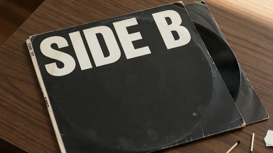
I sat at my mixing console yesterday afternoon staring at the completed square image export for our acoustic compilation release. The artwork composition was solid, but the bottom badge clearly displayed VOL. 1 in heavy, weathered grotesque lettering. We had decided earlier that morning to shuffle our release schedule and launch the second session first, which meant the badge needed to read VOL. 2.
Our graphic designer was on a flight across the country, and the layered production archive sat on an external hard drive back in our locked rehearsal facility. I only had the flattened PNG proof saved on my laptop desktop, completely devoid of live typography layers or vector outlines. When you find yourself under a tight distributor upload deadline, recreating an entire textured graphic from scratch is an unnecessary hurdle.
It helps to establish immediately what this process is and what it is not. This is not an online template generator where you choose a stock background and drop generic typography over prefabricated shapes. You are working with your own exported artwork, and you type the replacement wording into the system yourself. The goal is simply to revise specific letters directly on an already rendered image file that needs an isolated text correction.
The foundational principle of digital graphics is simple and uncompromising. If you still have the native project file open in Photoshop or your chosen design program, you should always return to the source to edit the text box. Working directly with live type layers guarantees crisp vectors, customizable tracking, and pristine kerning without touching background pixels. You should only ever resort to pixel editing when the working design file is unavailable and the flattened raster image is the only asset in your possession.
Independent musicians encounter flattened graphics far more often than traditional graphic design tutorials admit. You might receive a flattened proof from an overseas collaborator, recover a legacy master from an old hard drive, or inherit a rasterized square from a previous promotional campaign. In these specific circumstances, working with an engine built to interpret baked-in characters allows you to make necessary adjustments to an isolated image file. You can see how this raster workflow operates by visiting Edit Text in Image when you need to revise a flattened file.
Before you make any changes to a graphic, you must consider the legal and ethical boundaries of your project. You should only edit artwork, sample proofs, or cover exports that you own or have explicit authorization to modify. An artist name should only be changed when this is your own album cover and you are entering your own authentic name into the prompt field. You must never superimpose or attach someone else's artist name onto album art that does not belong to you.
Certain packaging elements must remain entirely off-limits during any image revision. Barcodes, catalog reference numbers, and official copyright lines represent legal distribution metadata rather than decorative type. Tampering with those regulatory markings on an exported file creates severe verification issues with streaming platforms and manufacturing plants. Furthermore, if you are pressing physical vinyl records or manufacturing compact discs, your promotional cover photos must match the physical product exactly.
When you load a flattened square file into ReWords AI, the model evaluates the visual environment surrounding the existing typography. It inspects local gradients, background noise, compression grain, and lighting contrast across the letters. Instead of forcing you to hunt down and purchase matching typeface files, the system analyzes the visual structure of the glyphs already on the canvas. You can inspect this dedicated music sleeve workflow at Edit Text on an Album Cover when managing flattened release graphics.
The interface breaks down detected typography into separate rows so you can handle each line independently. Text detection costs zero credits, allowing you to examine how the engine reads your cover before committing any resources. When you want to protect certain lines—such as a series subtitle or an engineer credit—you simply use the Lock button to keep them untouched. If you decide that an extra descriptive badge is no longer needed on your artwork, leaving that line blank removes it completely.
For my acoustic project, I left the surrounding credits locked and focused exclusively on the title badge. I typed VOL. 2 into the text box and allowed the synthesis engine to reconstruct the Roman numeral. The system does not install custom font files onto your system or access an external typography catalog. Instead, it generates fresh pixels that reflect the stroke width, texture, and visual weight of the original characters.
The platform operates on a transparent credit model based entirely on output resolution rather than subscription lock-ins. Running a generation at 1K resolution requires 10 credits, a 2K render requires 20 credits, and an ultra-high-definition 4K export consumes 30 credits. Every user receives trial credits immediately upon logging in, giving you the opportunity to test your files before purchasing additional credits. You can select lower tiers for social media teasers and reserve higher tiers for primary distributor deliverables.
It is equally important to understand the platform boundaries before incorporating it into your routine. There is no unlimited free tier, and the platform does not offer a batch API for high-volume automated processing. The system accepts static raster image files exclusively, supporting standard PNG, JPG, and WebP formats. If you need to manipulate animated canvas loops or video promotional materials, you will need to utilize dedicated video compositing software.
Raster text generation functions as a best-effort visual approximation rather than a lossless vector reconstruction. Because the underlying design layers are absent, the system must extrapolate what the background looks like beneath the original ink. It balances letter spacing, surface wear, and local contrast to blend the new characters naturally into the scene. You can explore how this visual matching behaves across different layouts through Same-Font Image Text Editor before preparing your files.
Album cover art frequently incorporates complex aesthetic treatments such as subtle film grain, paper friction, and gentle vignette shading. Traditional inpainting techniques often blur these micro-textures, creating a flat digital patch that looks obvious against an analog background. The generation engine attempts to reproduce the surrounding texture across the strokes of the new letters. This attention to surface detail ensures that the updated text integrates naturally with the surrounding artwork instead of appearing artificially pasted on top.
Achieving clean visual results depends heavily on the quality of the image you upload to the workspace. You should always provide the highest resolution raster export available to avoid magnifying existing compression artifacts. Heavy JPEG blocking around letter edges makes it harder for the detection algorithm to trace clean boundary paths. Cropping away unnecessary borders or external frames before uploading also helps the model focus its processing power directly on the typography.
Color management is another factor to consider when preparing your music artwork for distribution. Most digital streaming aggregators demand RGB image files, whereas commercial print shops work exclusively with CMYK proofs. If you are modifying a print proof, ensure your final raster output retains the proper color profile before sending it to a manufacturing facility. Performing a quick side-by-side color inspection on a calibrated monitor will confirm that the replacement lettering matches the rest of the sleeve.
Independent labels and solo artists frequently manage ongoing series releases across extended production cycles. Maintaining strict visual consistency between consecutive volumes helps build an identifiable visual brand for your catalog. Being able to update a volume badge on an established square proof saves critical days during the final distribution push. As long as you maintain clear expectations regarding raster synthesis, the process offers a dependable way to keep projects on track.
Once your generated image completes at your selected resolution tier, download the file and examine it at full scale. Check the baseline alignment, character spacing, and contrast against the underlying background art. If you notice minor tonal differences along the perimeter of the modified area, a subtle touch in an image editor can blend the transition. For standard digital release submissions, this method delivers a cohesive presentation that preserves the spirit of the original design.
Edit Text in Image
Edit text in finished images with our free online image text editor.
The Bottom Line
Modifying flattened text on an exported album cover is an effective solution when native design files are unavailable. It is a specialized pixel-level tool designed for legitimate catalog maintenance, not a generic template generator or a means to alter someone else's artistic identity. By respecting copyright boundaries, keeping legal distribution markings intact, and choosing the appropriate resolution tier for your needs, you can solve artwork emergencies efficiently.
Sources
- https://en.wikipedia.org/wiki/Album
- https://en.wikipedia.org/wiki/Compilation_album
- https://en.wikipedia.org/wiki/Album_cover