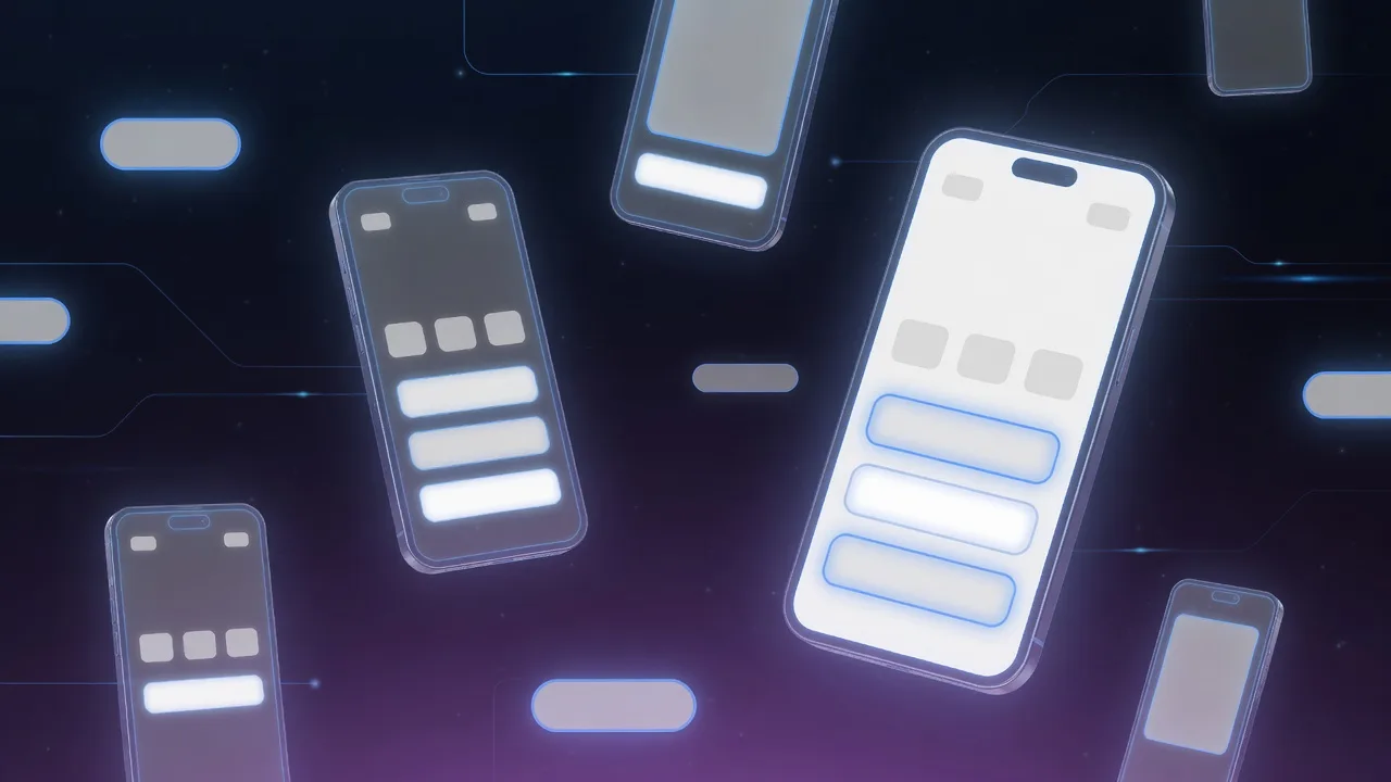
You have an app screenshot, and you need to change a button label from "Sign Up" to "Get Started," or update a pricing card from "$9.99" to "£8.99." It sounds like a "select text → type → save" operation. But the moment you open your editing software, you realize the problem: the text in a screenshot isn't a text object. It's been baked into pixels by the system's layout engine, font hinting, antialiasing, subpixel rendering, and display density working together. You're not editing words—you're reconstructing a pixelated typesetting result.
Here's the central insight of this guide: if you have access to the product's source code or design files, the best approach is usually not "editing the image" but "regenerating the screenshot." Apple has built localization screenshot export directly into the Xcode testing workflow; Android provides pseudolocales to catch truncation and layout issues before they reach production. For localization, A/B variants, and multi-language store screenshots, source-driven re-screenshotting beats bitmap editing on consistency, maintainability, and scalability every time.
When you don't have source access, the priority order should be: layer/vector reconstruction > OCR + re-rendering > pixel-level patching > AI inpainting as a helper. The reason is straightforward: your ability to convincingly replicate text depends on your ability to reproduce the typesetting environment, not your ability to "cover up the old words."
If you just need to swap a few words quickly without diving into toolchains, tools like ReWords AI let you upload an image, box the text area, and replace the copy directly. But for work that requires precise typographic control or complex backgrounds, understanding the principles below is what turns guesswork into judgment.
Before You Open Any Software, Ask Three Questions
First: can you regenerate the screenshot from source?
If you can touch the product—change a string, run a UI test, export a fresh screenshot—don't start by erasing pixels. Apple's localization testing documentation explains how to export localized screenshots from successful UI tests. Android's localization guide provides resource frameworks and pseudolocale testing. If your copy will change a second or third time, regeneration will always pay back its cost.
Second: do you have design source files you can reconstruct from?
Figma and Sketch are built around a component model that maps naturally to "text layer + icon layer + background shape layer + shadow layer" reconstruction. If you need to edit not one screenshot but an entire set—across languages, sizes, and iterations—rebuilding components in a vector design tool is far more stable than editing images one by one.
Third: do you need this at scale?
When the problem shifts from "one image" to "dozens of screenshots in fifteen languages," batch pipelines become a necessity. Pixel-level methods spiral out of control at scale—the cumulative manual adjustment time grows exponentially.
Here's a decision flowchart:
`` You have a screenshot ├─ Can you regenerate from source? → Change the copy and re-capture (best path) ├─ Do you have design files? → Reconstruct components in Figma/Sketch, batch export └─ Neither → Assess background complexity ├─ Solid color / simple gradient → Pixel patching + re-type (fast) ├─ Translucent / frosted glass / shadows → Vector overlay + precise typesetting (stable) └─ Complex texture / photo background → AI inpainting for background + manual typography (hard) ``
Not All Screenshots Are the Same
Different screenshot sources call for fundamentally different editing strategies. Categorizing your scenario correctly matters more than picking the right tool.
| Screenshot Type | Typical Source | Common Editing Needs | Preferred Strategy |
|---|---|---|---|
| Native system screenshot | iOS / Android / macOS / Windows | Button labels, status text, form fields, localization | Regenerate if possible; otherwise OCR + vector reconstruction |
| Web page screenshot | Browser, SaaS dashboards, responsive sites | Copy swaps, pricing, CTAs, experiment mockups | Edit HTML/CSS and re-capture; fallback: vector overlay |
| Marketing / demo screenshot | App Store, landing pages, ad creatives | USP copy, language variants, badge adjustments | Design tool layer reconstruction |
| Knowledge base / tutorial screenshot | Help centers, training docs | UI version updates, highlights, annotations | Vector overlay + preserve base image |
| Business screenshot with PII | Chat, CRM, tickets, admin reports | Name, phone, email, order number redaction | OCR detection + local masking/redrawing |
| Screenshots with complex badges/icons | Settings, card lists, notification centers | Badge numbers, status icons, star ratings | Component-level reconstruction; avoid pure erasure |
The Method Spectrum: Four Paths, Fundamentally Different Boundaries
Path 1: Pixel-Level Editing—Direct but Capped
The core idea: remove the old text, then place new text on top. This is the domain of Photoshop's Remove Tool and Generative Fill, GIMP's Heal and Clone, and OpenCV's inpaint.
GIMP's Heal tool documentation explicitly notes that it blends by considering the surrounding context rather than simply copying. OpenCV's inpaint tutorial describes it as reconstructing selected regions from pixels near the boundary. The advantage: fast and effective for single images. The disadvantage: it struggles to replicate the original typographic style, especially on translucent backgrounds, frosted glass, gradients, and shadows.
Best for three scenarios: single-line text on solid or low-texture backgrounds; swapping digits, labels, or button words; redacting sensitive data with placeholder replacement. Not suited for rewriting paragraphs—background reconstruction is usually straightforward, but glyph reconstruction is where things most often look fake.
Path 2: Vector Overlay & Layer Reconstruction—The Sweet Spot Without Source Files
The idea isn't to patch pixels, but to treat the screenshot as a background plate and rebuild on top using vector text, shapes, and icon components.
This approach excels at: badges, price chips, tabs, buttons, navigation items, list rows, status pills, hero captions, and product feature cards. Once you decompose these elements into "text layer + icon layer + background shape layer + shadow layer," subsequent localization and A/B copy swaps become structured work rather than blind image editing.
Key operational detail: measure the original text's left edge, baseline position, and bounding box height before aligning in your vector tool. Don't eyeball it—pixel-level misalignment becomes obvious at 200% zoom.
Path 3: OCR + Re-Rendering—The Engineering Approach for Batch Work
The most important value OCR delivers isn't "reading the content"—it's providing text box positions, word-level geometry, and typographic hierarchy. Tesseract's official documentation supports TSV, hOCR, and multiple output formats that give you precise word-level bounding boxes. Google Vision and AWS Rekognition similarly return bounding boxes with confidence scores.
But OCR has limits: it tells you accurately where text is, but not necessarily what font, tracking, line height, and rendering mode were used. So OCR works best as a detection layer, not a finishing layer. The best practice: OCR for positioning + background reconstruction + manual/template-based re-typesetting.
Path 4: AI Inpainting—A Background Restorer, Not a Typesetting Engine
AI inpainting (such as Stable Diffusion's inpainting pipeline) is valuable for repairing backgrounds, not for laying out text. It handles complex textures, frosted glass, drop shadows, button glows, and illustrated interfaces well—but the moment you ask it to "also generate the text," font consistency drops sharply.
The verdict: AI works best as a background restorer, not a final copy renderer. The most reliable approach is to use AI to clean up old text traces first, then return to vector or precise text tools to place new copy according to a template.
Method Comparison at a Glance
| Method | Speed | Fidelity | Automation Potential | Main Risk | Best For |
|---|---|---|---|---|---|
| Pixel patching + manual re-type | Fast | Medium | Low | Font and edges tend to look fake | Single-image small edits, button/label swaps |
| Vector overlay / layer reconstruction | Medium | High | Medium to High | Requires component decomposition and measurement | Marketing images, A/B variants |
| OCR + re-rendering | Medium | High | High | OCR positions are accurate but font may not be | Batch replacement, template-based localization |
| AI inpainting + manual finishing | Medium | Medium to High | Medium | Generated text style drift | Complex backgrounds, glass/gradient/shadow repair |
| Source/design file regeneration | Slower per image, faster at scale | Highest | Highest | Requires source system access | Large-scale localization, store screenshots |
Five Details That Make or Break the Result
What determines success in screenshot text editing isn't "does it use AI"—it's these five details.
1. Accurate Font Identification
For Latin-script interfaces, start with WhatTheFont to identify candidate typefaces from an uploaded image. But for UI screenshots, a more reliable approach is to work backward from the platform's system font stack:
- Apple platforms: check San Francisco family and SF Symbols first
- Android / Material: cross-reference Material 3 Typography and Material Symbols
- Windows: check Segoe UI Variable and Segoe Fluent Icons
For CJK (Chinese, Japanese, Korean) interfaces, platform system fonts and specifications are often more reliable than general-purpose font identification tools.
2. Correct Font Size and Weight
The most common pitfall in screenshot fidelity isn't choosing the wrong typeface—it's getting the weight wrong. Regular and Medium from the same font family can look only a few pixels apart in a screenshot, but the visual difference is significant. Use OCR bounding boxes or manual measurement to determine the pixel height of the original text, then work backward to the point size.
3. Spacing and Baseline Alignment
Figma, Sketch, system UI engines, and browsers don't produce identical typesetting results. Even with the same font, tracking and baseline handling can differ. The safest method: measure the original text's left edge, baseline position, and box height, then align to integer pixels.
4. Color and Shadow Reproduction
Don't sample color just once. For buttons, pills, status badges, and light overlays, sample multiple points around the text to determine whether the background is solid, a gradient, or a translucent overlay. Solid colors can be averaged; gradients are best handled by restoring the background first; translucent layers require attention to how new text will look after compositing with the background.
5. Pixel Grid Alignment
Windows' ClearType is subpixel antialiasing, not standard grayscale antialiasing. A screenshot taken on Windows, if re-typeset on a different system, will often show inconsistent color fringing and sharpness. The most practical rules: render on the same platform and scaling factor as the original screenshot, and keep all text and fine icons on integer pixel coordinates.
Platform Differences: Same Text, Different Appearance
iOS & macOS
Apple's HIG Typography specifies that San Francisco has multiple variants serving different platform contexts. SF Symbols is designed to integrate seamlessly with the system font. For iOS/macOS screenshots, you can almost always find the closest match from the system font and symbol library.
Android
Material 3's Typography and Icons documentation make it clear that text specifications, icon systems, and multi-density resources are designed to work together. Don't stretch an mdpi text image into an xxhdpi mockup—icons will blur and text will look fake.
Web
The biggest trap with web screenshots is assuming "the same page" equals "the same image at a different size." MDN's responsive design documentation explains that pages render differently at different viewport widths and device pixel ratios. The correct approach isn't scaling a desktop screenshot down to mobile in Photoshop—it's re-capturing at the target breakpoint and DPR.
Windows
Windows 11's system font family includes Segoe UI Variable and Segoe Fluent Icons. Combined with ClearType's subpixel rendering, the conclusion is: for high-fidelity Windows screenshot editing, do your typesetting and review on a Windows environment. The most common tells when cross-system editing creeps in are light-colored thin text and small icons on dark backgrounds.
Batch Automation: From "One Image" to "A System"
When your problem shifts from one image to dozens of screenshots in fifteen languages, you need a pipeline.
The optimal batch path remains "regenerate first." Apple supports exporting localized screenshots from tests. Android provides localization resources and pseudolocale testing. If you can reach the product side, this pays off in the long run.
Without source access, the batch path is "OCR + templates + batch export": first, use Tesseract to output TSV/hOCR for text bounding boxes; then, classify screenshots by template (e.g., "pricing card page," "settings list page," "message list page"); same template, same font, coordinates, and component definitions. This way you're not customizing each image individually—you're modeling each layout once.
Practical Command-Line Examples
```bash
Tesseract: export word-level bounding boxes
tesseract screen.png - -l eng+chi_sim --psm 6 tsv > screen.tsv
ImageMagick: precise text overlay
magick input.png \ -font "Inter-Regular" \ -pointsize 16 \ -fill "#1F2328" \ -gravity northwest \ -annotate +120+48 "New Label" \ output.png ```
ImageMagick's official documentation covers coordinate control for -annotate in detail. Tesseract's CLI documentation covers TSV, hOCR, PDF, and other output formats. Combined with Pillow (Python Imaging Library), you can build a reproducible, auditable batch overlay pipeline in a few dozen lines of Python.
Quality Assurance Checklist
If your only standard is "looks about right," batch projects will eventually fail. Check at minimum at 100% / 200% / 400% zoom levels:
| Check Item | Passing Standard | Failure Symptoms |
|---|---|---|
| Copy content | Matches target language/version exactly | Missed edits, typos, old text remnants |
| Position & alignment | Left edge, baseline, internal padding are stable | Looks "floating" or "cramped" |
| Font & weight | Consistent with platform or component system | Visual character feels off, uneven thickness |
| Antialiasing | Clean edges, no color fringe anomalies | Blur, jaggies, blue/red fringing |
| Background repair | No repeating textures, no inpainting seams | Blurry patches, visible patch boundaries, lost glass texture |
| Icons & badges | Style, size, baseline consistent | Icon proportions wrong, numbers off-center |
For automated metrics, use scikit-image's SSIM to verify that non-edited regions haven't been affected, then OCR the output to confirm the target text is correct and in the right position.
Legal & Ethical Boundaries
The EU's General Data Protection Regulation (GDPR) establishes comprehensive protections for personal data of individuals in the European Economic Area. In the United States, the California Consumer Privacy Act (CCPA) grants consumers rights over their personal information, while HIPAA imposes strict requirements on handling protected health information. For data pertaining to children under 13, COPPA (Children's Online Privacy Protection Act) adds additional compliance obligations. This means you cannot treat screenshots containing phone numbers, emails, addresses, order numbers, or chat records as ordinary visual assets to be casually shared. When such screenshots must be used, prioritize local processing and irreversible redaction.
Apple's App Store product page guidelines emphasize that screenshots should communicate the app's user experience using actual UI—store screenshots carry an implicit claim about real functionality. Edits that fabricate non-existent features, prices, or data carry risk beyond aesthetics: they constitute misleading representation.
If you use generative editing or share assets across teams, preserve a verifiable editing trail. C2PA (Coalition for Content Provenance and Authenticity) defines an open standard for content provenance and authenticity—not as "political correctness," but as an engineering measure to reduce future dispute costs.
Fonts and icons can't be used just because you can see them. Material Symbols use the Apache 2.0 license. Google's Noto font family uses the SIL Open Font License, making it a safe alternative. Commercial fonts and brand logos require license confirmation before use.
Summary: Split One Problem Into Two
If I had to give the single most practical, least flashy piece of advice, it would be this:
Split "editing text in screenshots" into two separate problems—"restore the background" and "reconstruct the typesetting"—and don't try to solve both elegantly with a single tool.
Background restoration: use Heal, Clone, Inpaint, or AI. Typesetting reconstruction: use system fonts, vector overlays, components, and precise text tools. Follow this line and your output will be more stable than any "one-click AI text replacement," and far easier to batch, maintain, and audit.
The best general-purpose path isn't any single magic tool—it's this sequence:
- First, check if you can regenerate or reconstruct—if you have source, re-capture; if you have design files, rebuild components
- Then choose a background repair method based on complexity—solid colors get direct fill, complex textures need inpainting/AI
- Next, precisely match font and typesetting parameters—work backward from the platform's system font stack, align to integer pixels
- Finally, QA at multiple zoom levels—100% for overall feel, 200% for edges, 400% for antialiasing artifacts
Once you understand these principles, every tool choice—opening Photoshop to refine a single image, rebuilding a component set in Figma, scripting a batch pipeline, or using ReWords AI for a quick text swap—becomes an informed decision rather than "let's try this and see."