I watched a clean packaging label collapse the moment four concise Asian characters turned into twelve sprawling capital letters. The original neat badge that once held 使用说明 suddenly had INSTRUCTIONS crashing straight through its rounded border, spilling bright white lettering across the product illustration behind it. You have likely experienced this exact catastrophe when trying to translate an image to English on a finished, print-ready layout.
On an angled metallic cosmetic box, another test produced faint, murky halos where the previous kanji characters used to sit. The brushed aluminum background looked unnaturally smeared, and the new English phrase drifted off the perspective plane like a crooked sticker. When you need a polished, ready-to-share graphic for a digital storefront or catalog, these visual defects destroy the professional credibility of your asset.
The job of this article is to examine why an image translator to English breaks down on still graphics and how you can rescue the layout. We are not discussing transient smartphone viewfinders or theoretical machine translation models here. Instead, we are troubleshooting real still files—specifically flat PNG, JPG, and WebP graphics—where automated engines miscalculate typography, inpainting boundaries, and three-dimensional perspective.
Google Translate Camera
Upload photos to our free online camera text translator for clean in-image translation without jitter.
Live Camera Overlays Versus Permanent Still Graphics
When you point your smartphone lens at foreign street signage, a tool like Google Translate Camera works wonders by projecting a transient digital overlay directly across your screen. That temporary projection exists solely to help you understand a message on the fly, without altering the underlying image data or preserving canvas harmony. A still graphic export, however, faces a vastly unforgiving standard because every modified pixel remains permanently frozen under close scrutiny.
Producing a publishable visual asset requires cleanly erasing the source typography, reconstructing obscured background textures, and rendering replacement characters with matching lighting, weight, and alignment. Modern platforms that Translate Image to English must perform both generative graphic repair and contextual typography in a single automated pass. When any link in that complex chain falters, the entire visual hierarchy of your design collapses.
English Text Expansion and Badge Overflow
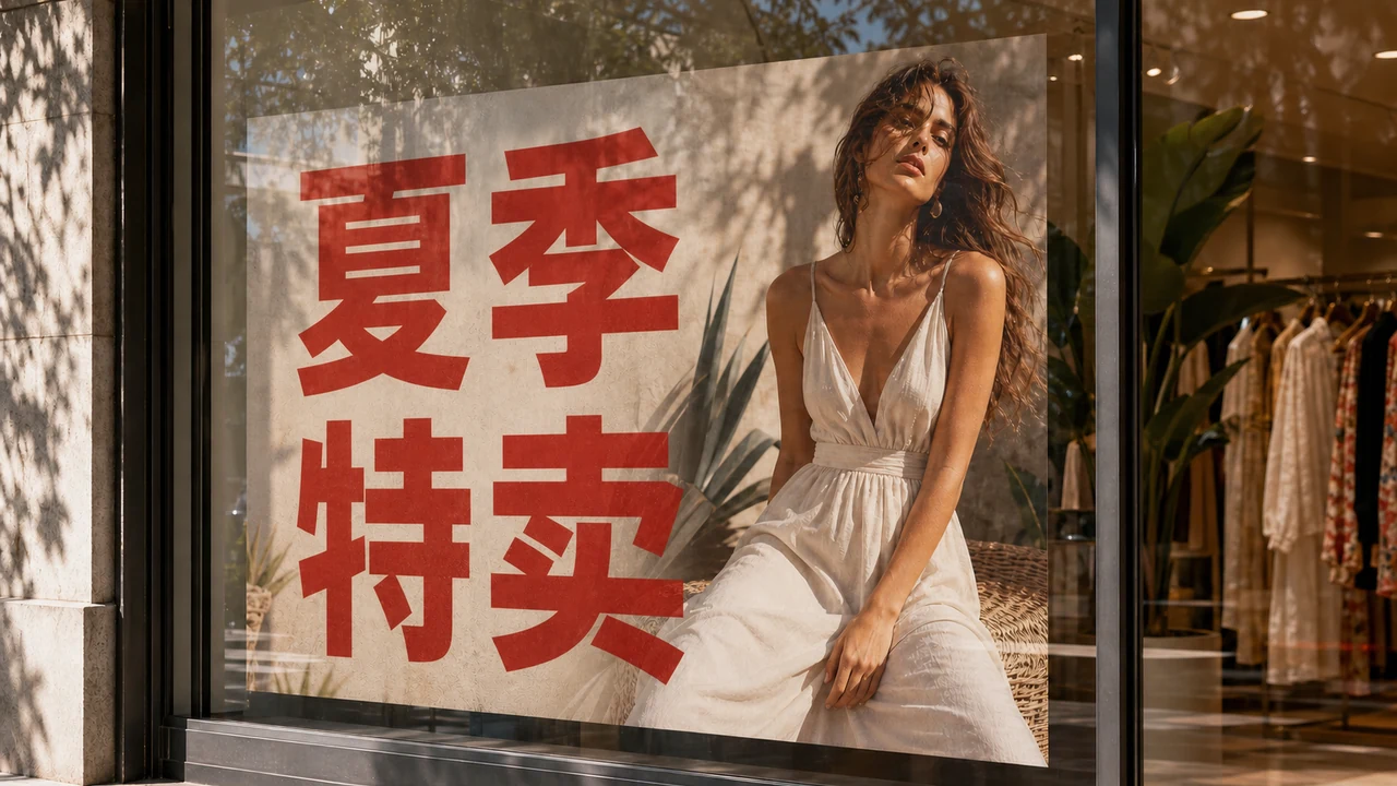
The most frequent layout failure in graphic translation stems from fundamental linguistic geometry. Asian logograms, condensed scripts, and compounded terms pack substantial semantic meaning into compact, square bounding boxes. When an automated engine renders those concepts into English, the resulting string of Latin characters almost always expands horizontally by a massive margin.
A tight pill badge, circular promotional stamp, or navigation button designed for a few compact glyphs simply cannot house a multi-word English phrase. Automated engines often respond by shrinking the font size until the lettering turns into an unreadable smudge, or by allowing the text to punch through solid border lines. If the engine preserves the original point size, words wrap unpredictably across multiple lines, colliding with critical graphic elements or product photography.
Layout collapse is not limited to East Asian source text; dense European graphics encounter identical spatial friction when technical terms are converted. When a layout designed around tight phrasing expands during rendering, neighboring captions overlap and margins vanish. The graphic stops looking like an intentional piece of marketing collateral and begins looking like a damaged template.
You can rescue these congested badges by taking control of the phrasing before committing to a final render. Shorten lengthy literal outputs into punchy English terms, such as replacing "DETAILED OPERATIONAL INSTRUCTIONS" with a direct "GUIDE" or "MANUAL". Remember that you own the wording and must check every phrase yourself, because no automated lettering pipeline grants legal clearance, regulatory compliance, or print certification.
Ghost Letters, Stroke Halos, and Texture Smears
Another jarring failure occurs when the generative eraser fails to eliminate every trace of the source lettering. You will often see murky gray outlines, faint edge halos, or disconnected stroke tips lingering behind the newly rendered English words. These leftover marks, commonly called ghost letters, signal an incomplete segmentation mask during the background inpainting phase.
Complex background textures make clean text eradication notoriously difficult for computer vision models. When a system attempts to Translate Text in Image across wood grain, carbon fiber, halftone dots, or subtle drop shadows, the inpainter can easily smudge the surrounding material into muddy blotches. Instead of a pristine surface, you end up with an unnatural blur that draws the viewer's eye straight to the alteration.
High-contrast borders and sharp drop shadows present an identical challenge for automated inpainting algorithms. If the generative mask clips too close to the letterforms, the outer glow or shadow remains permanently stuck to the background canvas. Conversely, if the mask dilates too widely, it chews away adjoining framing lines, leaves jagged notches in neighboring artwork, and ruins the underlying texture.
This issue becomes particularly glaring on technical diagrams and product schematics where fine vector-style lines intersect typography. An over-aggressive inpainting pass will erase sections of dimension lines, arrows, or circuit traces along with the characters. When the new English lettering is placed on top, the gaps in the schematic remain visible, signaling to anyone inspecting the diagram that the graphic has been carelessly retouched.
Perspective Baselines, Curved Surfaces, and Handwriting
Flat rectangular banners are relatively simple for bounding boxes to detect, but real-world graphics frequently feature angled objects, three-dimensional packaging, and vanishing baselines. When a translation model detects text on a tilted box or isometric banner, it often misjudges the perspective vanishing point. The generated English words end up sitting perfectly horizontal across an angled plane, breaking spatial realism completely.
Curved surfaces compound this spatial dissonance and expose the limitations of flat planar typography. When text wraps around a soda can, wine bottle, or cylindrical cosmetic tube, Latin letterforms must compress nonlinearly along the curvature of the cylinder. Automated renderers typically apply a uniform slant or simple two-dimensional skew instead of genuine cylindrical mapping, creating an awkward, floating label effect.
Handwritten notes, decorative script fonts, and distressed brush lettering create even steeper hurdles for automated systems. Optical recognition models frequently fragment cursive loops into disconnected shapes or misinterpret stylized flourishes as stray scratches. The resulting English replacements usually default to sterile geometric sans-serif lettering that clashes aggressively with the artistic tone of the original piece.
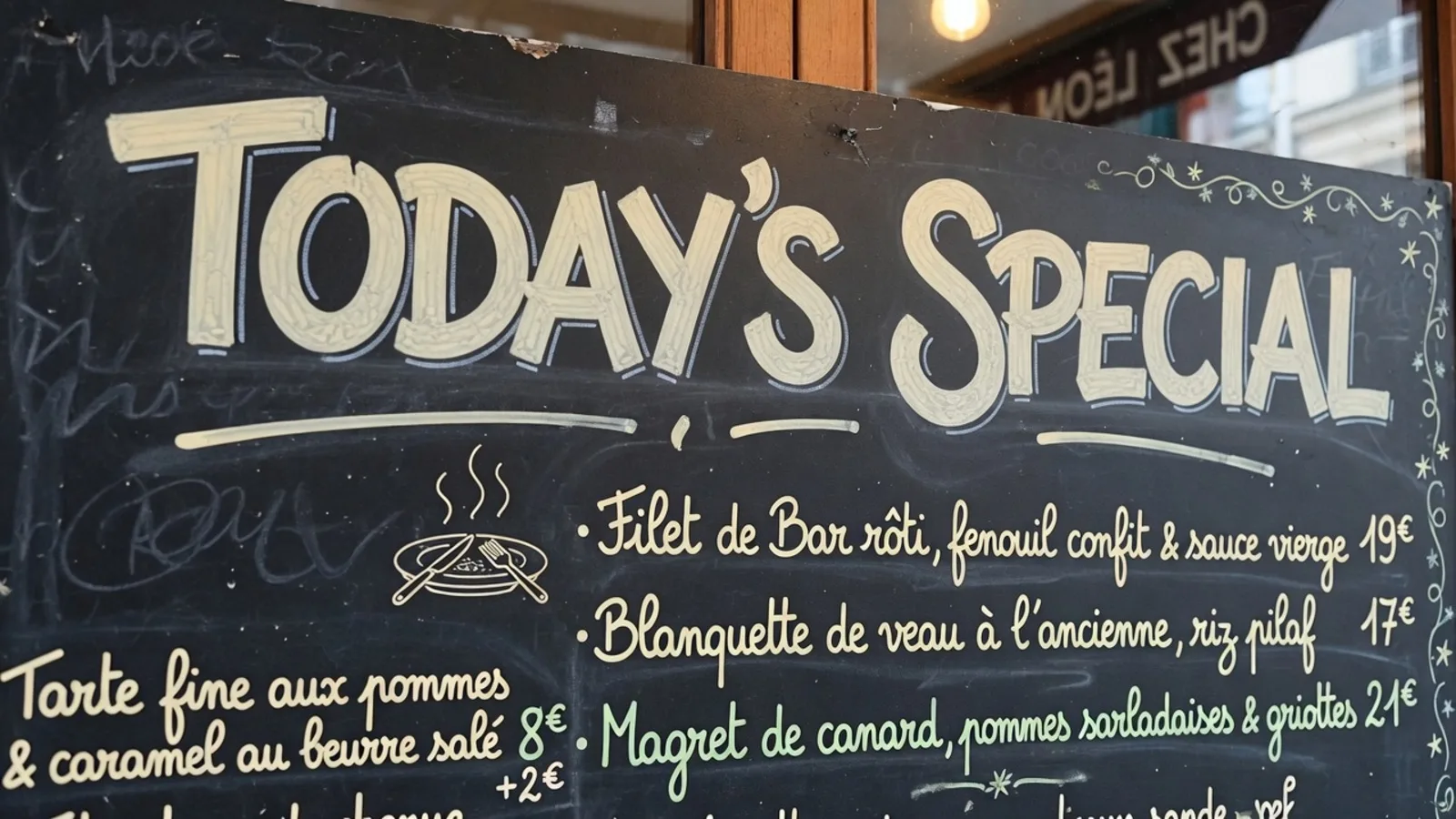
Variable baseline drift on artisanal packaging or restaurant chalkboards poses a similar problem. Because handwritten script rarely adheres to a mechanical straight line, automated tools struggle to anchor the bounding box naturally. The replacement typeface appears rigid and artificial, highlighting the seams between the original illustration and the translated text.
Garbled Decoding, Encoding Conflicts, and Mojibake
Visual distortion is not the only way an image translation fails; sometimes the textual content itself turns into pure gibberish. When character encodings clash or optical recognition models confuse visually similar glyphs, the output can collapse into bizarre symbols, question marks, or empty rectangular boxes. This phenomenon, historically known as mojibake, leaves your graphic looking broken and amateurish.
Diacritics, accented letters, and non-standard punctuation marks are frequent casualties during automated font substitution. If the target font library lacks glyphs for specific accents or ligature combinations, the rendering engine either skips the character entirely or substitutes a mismatched system glyph with contrasting stroke thickness. The resulting text appears patchy, with inconsistent character heights and irregular kerning across the baseline.
Cultural idioms, technical jargon, and poetic wordplay create an invisible layer of failure where the lettering looks crisp but the message is entirely wrong. Machine translation models frequently produce literal word-for-word substitutions that strip away critical context or introduce baffling terminology into your marketing layout. You must always review the semantic meaning of every line, as the machine provides best-effort visual suggestions rather than certified editorial translations.
Numeric data, measurement units, and currency symbols can also become corrupted during character recognition. A stylized comma can easily be mistaken for a period, turning an innocuous product dimension or price point into a confusing error. Because automated models lack human common sense about the graphic's context, unverified numbers can lead to embarrassing public mistakes.
Rescuing Broken Layouts with Line Locks and Manual Edits
Fixing an image that broke during translation does not require starting from scratch with external raster design software. When a busy graphic contains brand names, trademarks, or decorative elements that you want untouched, you should use the line lock feature. Locking freezes a detected line exactly as it sits, preventing the engine from erasing or reinterpreting that specific element while allowing you to translate surrounding text blocks safely.
It is crucial to understand that locking acts upon a detected line rather than a Photoshop layer. Still graphic formats like PNG, JPG, and WebP do not contain isolated graphic layers, so the system relies on vector bounding boxes to isolate each phrase. When you lock a line, you preserve that exact spatial region from generative inpainting and typographic replacement.
Pairing selective line locks with aggressive text editing lets you resolve almost any layout collapse. If an English translation spills over a button, trim filler words, swap in concise synonyms, or break the phrase across controlled line breaks. Detection and English suggestions cost no credits, while generating a finished still render spends credits based on your resolution tier.
Always approach automated lettering as a best-effort visual approximation rather than a lossless replacement. The software does not extract or install the original commercial font file, nor does it guarantee typographic perfection across complex artistic assets. You retain full ownership of the final wording and layout, meaning the ultimate responsibility for quality, compliance, and clarity rests in your hands.
The Bottom Line
Translating a still graphic is fundamentally harder than displaying a live camera overlay because the final canvas must permanently balance text rendering, background reconstruction, and spatial geometry. When English text expansion bursts your badges, ghost letters stain your textures, or vanishing lines drift off-axis, you have clear mechanisms to salvage the asset. Shorten expansive phrasing, verify every semantic meaning, and freeze untouched text using line locks to produce balanced, professional still images.