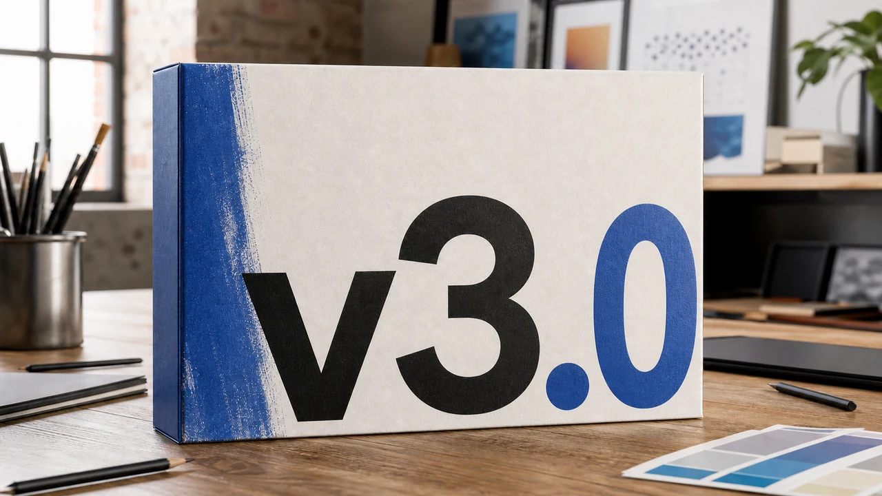
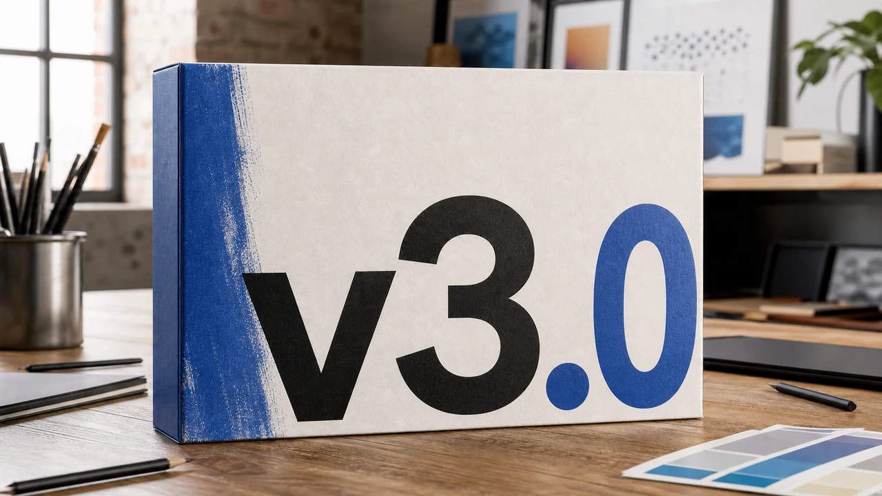
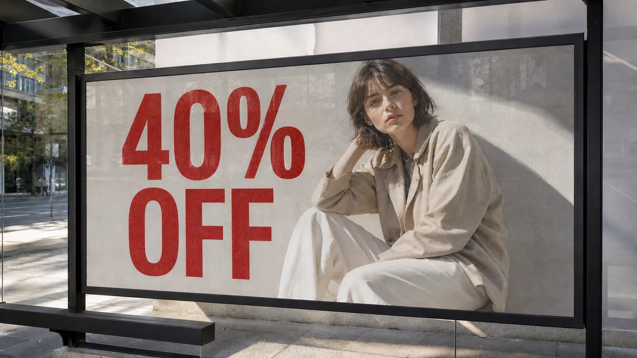
I recently found myself examining a photograph of an artisan paper coffee bag on my monitor. The client needed to replace the foil-stamped phrase "HOUSE BLEND" with the label "SINGLE ORIGIN" before a product launch. There was no brand guide in the shared folder, no vector asset package, and not a single note revealing the typeface name used on the packaging.
The file arrived as a flattened image rather than an editable design document. When you zoom into those letters at full scale, you find no vector coordinates or embedded typography metadata, but rather pixels blending quietly into the textured paper grain. Addressing this dilemma requires understanding what happens when typography is flattened, why the original font file cannot simply be extracted from a picture, and how to maintain visual continuity when altering the wording.
If you still have the master design file containing live text layers, the best route is always to reopen the artwork in your primary design software. Launching your canvas in applications like Photoshop, Illustrator, Figma, or Canva allows you to highlight the characters and type your revision directly into the existing text frame. The program relies on your installed font files to draw authentic vector glyph curves, preserving the geometry, baseline positions, and proportional kerning intended by the original type foundry.
If the vector file exists but every typographic element was converted to outlines or expanded curves, the letters no longer function as live text. They are frozen as static vector shapes with anchor points, meaning you cannot backspace and insert different vocabulary into the layout. Modifying the wording under these conditions forces you to identify an approximate substitute font, rebuild matching bezier outlines from scratch, and manually rebalance the kerning against the original vector artboard.
If you only have a flat photo or raster bitmap like a PNG or JPG, you must redraw the replacement words based entirely on the visible stroke characteristics of the image. Modern image processing systems examine observed stroke widths, color values, edge softness, and ambient lighting to generate new letterforms that match the existing visual tone. This is fundamentally a best-effort visual reconstruction rather than a recovery of the original font file, meaning the software does not extract an installation archive or generate an operational desktop font.
Many people assume that because a human eye can easily recognize a distinctive typeface on a flat product package, software should be able to pull the font file out of the graphic. In reality, once an image is flattened into a static raster format like PNG, JPG, or WebP, the underlying digital typography disappears completely. The operating system discards the OpenType tables, hinting instructions, and vector glyph formulas, leaving behind only colored square pixels arranged across a fixed spatial grid.
The primary technical obstacle to clean text modification on flat bitmaps is anti-aliasing, which softens jagged raster edges by blending letter borders with the backdrop. When a dark letter sits against a beige paper substrate, the boundary pixels contain intermediate shades that blend ink and material into a smooth visual edge. If you attempt to scrape away the old letters using manual painting tools, you inevitably disturb that delicate transitional boundary, creating unnatural smudges or halo artifacts that immediately betray the edit.
Preserving visual balance across a modified line of text requires strict respect for traditional typographic rules that govern professional typesetting. You must align the replacement characters along the exact baseline of the original composition, ensuring that flat-bottomed letterforms sit evenly while rounded curves dip slightly below the line to maintain optical equilibrium. Furthermore, the perceived scale of the lettering depends on the em square proportions that govern how glyphs relate to overall line height and adjacent letter spacing.
Beyond horizontal baselines, you also have to evaluate stroke weight, optical contrast, and character tracking across the target phrase. Even within the same apparent typeface family, a word set in all capital letters demands different tracking than mixed-case copy to avoid feeling crowded or disjointed. When you need to Edit Text in Image with Same Font, your objective is to reproduce those optical relationships so the new phrase feels native to the composition rather than pasted on top of it.
Whenever designers need to track down an elusive typeface, they often turn to image-based font identifier tools by uploading a cropped sample of the text. These search engines catalog vast libraries of commercial and open-source styles, comparing your sample's silhouette against known type catalogs to suggest close stylistic cousins. While this approach can help you identify a font family for future design projects, it does not solve the immediate challenge of altering an existing flat packaging photograph where the background texture must remain intact.
Before neural image models became practical, altering flattened text meant laboriously cloning background textures over the old characters before attempting to typeset new words on an upper layer. You had to match the paper grain, synthesize directional studio lighting, and paint artificial drop shadows to make the new text sit comfortably inside the scene. This manual workflow often resulted in blurry patches, uneven paper fibers, or noticeable seams that broke the visual illusion under close inspection.
Specialized generative platforms take a completely different technical approach by handling background inpainting and letter synthesis simultaneously. Instead of erasing and re-layering, the engine studies the surrounding lighting, surface reflections, and neighboring glyph characteristics before redrawing the requested phrase in place. When you choose to Edit Text in Image, the platform recreates the tactile appearance of physical printing rather than just superimposing digital characters over a patched canvas.
Inside ReWords AI, the process begins when you upload your static graphic in a supported format such as PNG, JPG, or WebP. The platform runs automated text detection across the canvas to locate letter clusters, drawing bounding regions around every identified line without charging any credits for the analysis. You can inspect these detected boundaries and use the Lock feature to anchor specific lines in place, ensuring that nearby brand marks, certifications, or legal disclaimers remain entirely untouched while you work on the target phrase.
Once the target line is isolated, you enter your replacement text directly into the editing field. The platform does not attempt to guess what you want to say, nor does it present automated translation suggestions or intrusive autocomplete options. You retain absolute control over every word, character capitalization, and punctuation mark, allowing you to tailor the copy to your exact marketing or editorial requirements.
After you specify your replacement copy, rendering the final visual result requires generating a new image pass. ReWords AI operates on a credit-based structure where generation costs scale directly with the canvas resolution you choose to output. Generating a 1K resolution image requires 10 credits, a 2K render costs 20 credits, and a high-definition 4K export costs 30 credits.
New users receive trial credits upon registering an account and logging in, allowing you to test how well the system matches your specific assets. There are no unlimited free generation tiers, and the service does not provide an automated batch processing API for massive programmatic pipelines. The platform is designed specifically for deliberate visual modifications where visual fidelity on individual images takes priority over mass automated processing.
It is vital to understand the fundamental boundaries of working with rasterized graphics. Redrawing text on a flat image is an optical best-effort match, not a lossless digital process or a legally binding verification of packaging compliance. When you need to Change Text in Image, the system works diligently to align stroke widths, ambient lighting, and texture cues, but subtle variations in edge sharpness or paper texture may still appear upon close inspection.
For projects destined for large-format commercial offset printing or formal regulatory packaging submission, relying on raster image modifications should never replace official vector production files. If your packaging design must undergo rigorous legal scrutiny or pass strict barcode verification, finding the original design agency and licensing the actual font software remains indispensable. Image text editing excels at rapid marketing iterations, social media banners, pitch presentations, and e-commerce previews where recreating the entire artwork from scratch would be completely impractical.
Edit Text Same Font
Edit image words with our free online same font text editor.
The Bottom Line
Replacing flattened text on a static graphic without the original font file is fundamentally an art of visual approximation rather than technical recovery. When source artboards and vector curves are unavailable, matching the apparent typography requires respecting baselines, em square proportions, and the natural anti-aliasing of the camera capture. Modern redrawing tools allow you to update critical phrases on flat photos while preserving background integrity, giving you a practical path forward whenever missing font files threaten to stall your creative workflow.
Sources
- https://www.zhihu.com/question/291993817/answer/2909990538
- https://zhuanlan.zhihu.com/p/2081731743938355699
- https://www.zhihu.com/question/657445134/answer/3534376714
- https://en.wikipedia.org/wiki/Baseline_(typography)
- https://en.wikipedia.org/wiki/Em_(typography)
- https://en.wikipedia.org/wiki/Anti-aliasing